View Heirarchy
Views in a mobile application are typically associated with an activity and are used to render the UI associated with the activity. The view then contains components, known as widgets, for each UI element in the view. These widgets are then organized in the view using a layout that describes how the widgets are positioned. Finally, the appearance of the layout and widgets can be controlled/adjusted using attributes corresponding to the particular type of object.
Views can be created in several ways:
- XML file - allows for the layout and widgets for a static view to be specified at build time.
- Dynamic - allows for layouts and widgets to be added to a view at run time.
- Combo - allows for a layout and some widgets to be specified statically and then additional ones added at run time.
Furthermore, multiple views can be combined together into a ViewGroup object.
Once a view has been created (either statically or dynamically) an activity can select the current view to display using the method setContentView()).
Widgets
The basic UI components used in a view are known as widgets (which are actually subclasses of View). Each widget will have numerous attributes which are used to control the appearance of the widget in the view. Once a widget is created, often they will have event handlers registered to them such that the application will perform various actions depending on how the user interacted with the widget. Usually each widget will be given a unique id attribute so that they can be accessed by the application. Additionally, widgets will usually specify their layout_height and layout_width attributes to describe how they will scale relative to the content they contain. Two typical values for these attributes are
- wrap_content - the widget will dynamically size itself to fit the content within the widget
- fill_parent - the widget will expand to the full extent of the parent view
Some common widgets are Button, TextView, EditText, CheckBox, RadioButton, and Spinner.
Button
One of the most common UI widgets is Button which represents a push-button type object. Usually they simply have some associated text which appears inside the button boundaries and have a click callback registered to them. Typically buttons will use wrap_content attributes so they are rendered the size of the enclosed text. Hence the XML for a button might be:
<Button
    android:id="@+id/dumbButton"
    android:layout_height="wrap_content"
    android:layout_width="wrap_content"
    android:text="@string/button_text"
/>
Then within the activity code, the click callback would be registered by calling the setOnClickListener() method on the Button object passing as a parameter a new View.OnClickListener object which has an overridden onClick() method. Thus an example would be
final Button button = (Button) findViewById(R.id.dumbButton);
button.setOnClickListener(new View.OnClickListener() {
    @Override
    public void onClick(View v) {
        // Whatever TODO when button is clicked
    }
});
Note that the parameter to the onClick() method is a reference to the widget that was clicked.
Alternatively, the onClick XML attribute can be used to specify the name of the callback to be called when the button is clicked.
The background of a button can be set using the background attribute which can either be a resource or a color value, e.g. android:background="#FF0000" for a red button.
TextView
TextView widgets are typically used simply to place a label, i.e. static text, within a view. The text can be modified, however, if the TextView is given an id attribute and then the setText() method is called on a TextView object created from the resource id. Like all other widgets, any event handler can be registerd to a TextView if the application calls for user interaction with the widget. The extent attributes typically are specified as wrap_content for the layout_height and then either wrap_content or fill_parent for the layout_width. An example XML for a TextView might be:
<TextView
    android:id="@+id/nameLabel"
    android:layout_height="wrap_content"
    android:layout_width="wrap_content"
    android:text="@string/name_label"
/>
EditText
For text boxes that are meant to be editable, i.e. the user can enter text in them, usually an EditText widget is used. The text attribute (either in the XML or via the setText() method) can be used to prepopulate the text box with a default value if desired. Usually event handlers are not registered to EditText widgets, but rather the contents are retrieved from within the event handler of other widgets, e.g. when a button is pressed, using the getText() method on an EditText object. Thus typically the extents are set to wrap_content for the layout_height and fill_parent for the layout_width (so the EditText box fills the width of the screen). Example XML for an EditText widget might be
<EditText
    android:id="@+id/name"
    android:layout_height="wrap_content"
    android:layout_width="fill_parent"
    android:text="@string/name_edit"
/>
CheckBox
If there are certain choices that the user can select, often a CheckBox widget is used. This widget displays a small box that can toggle to checked or unchecked states. The checked attribute specifies the initial state of the CheckBox and the text attribute gives the text for the CheckBox. Typically the extents for CheckBoxes are wrap_content in both dimensions. Event handlers can be registered for the widget if some behavior should be performed whenever the state changes, otherwise the isChecked() method can be called on a CheckBox object within another method to determine the current state of the CheckBox. While the CheckBox widget will keep track of its current state, the state of the CheckBox can also be changed programmatically using the setChecked() method if desired (for example when restoring a view). For example, XML for a CheckBox that will call the onCapsClicked() method when the state changes might be:
<CheckBox
    android:id="@+id/capCheck"
    android:layout_width="wrap_content"
    android:layout_height="wrap_content"
    android:text="@string/cap_check_text"
    android:onClick="onCapsClicked"
/>
Then in the activity code, the onCapsClicked() method might be defined as
public void onCapsClicked(View v) {
    // Check if box is set or not
    if (((CheckBox) v).isChecked()) {
        // Do something when checked
    } else {
        // Do something else when unchecked
    }
}
Note that the View parameter will be a reference to the CheckBox that was selected and thus is cast within the method.
RadioButton
Radio buttons are typically used for mutually exclusive choices the user can make. Thus they are grouped inside a RadioGroup object which defines which buttons can only have a single one selected. Thus when one RadioButton is selected inside the group, all others are unselected. Usually all RadioButtons within a group will be assigned the same click handler (via the onClick attribute). Again usually wrap_content attributes are specified and the text attribute is used for the label of each button. For example, XML for a RadioButton group might be:
<RadioGroup
    android:layout_width="fill_parent"
    android:layout_height="wrap_content"
    android:orientation="vertical">
    <RadioButton
        android:id="@+id/firstNameCheck"
        android:layout_width="wrap_content"
        android:layout_height="wrap_content"
        android:text="@string/first_name_radio"
        android:onClick="onNameGroupClicked"
    />
    <RadioButton
        android:id="@+id/lastNameCheck"
        android:layout_width="wrap_content"
        android:layout_height="wrap_content"
        android:text="@string/last_name_radio"
        android:onClick="onNameGroupClicked"
    />
</RadioGroup>
RadioButton groups initially have none of the buttons selected (but will subsequently always only have one selected unless the clearCheck() method is called on the RadioGroup to clear all selections). An initial selection can be set with the setChecked() method called for the desired option. The callback method in the Activity might then be:
public void onNameGroupClicked(View v) {
    // Get radio button selected
    RadioButton rb = (RadioButton) v;
    // Perform appropriate action for selected option
}
An alternative to RadioButtons when there are only two selectable options is to use a ToggleButton where the text for the two states can be set in the textOn and textOff attributes.
Spinner
One other common widget for selectable lists of options is a Spinner which displays the list in a "slot machine" type control that allows the user to then choose one of the items in the list. The Spinner is populated with data from an Adapter (or one of its subclasses). Additionally, the prompt displayed inside the spinner can be specified in the prompt attribute for the widget. Thus example XML code for a Spinner might be:
<Spinner
    android:id="@+id/titleSpinner"
    android:layout_width="fill_parent"
    android:layout_height="wrap_content"
    android:prompt="@string/spin_title"
/>
To populate the items in the Spinner, one option is to use a string array (via the \<string-array>\</string-array> tags) stored in the strings.xml resource file by creating XML with each item in \<item>\</item> tags. For example,
<string-array name="titles">
    <item>Mr.</item>
    <item>Mrs.</item>
    <item>Miss</item>
</string-array>
Then we can create an ArrayAdapter object from the string array stored in the resource and initialize the Spinner with the ArrayAdapter as:
Spinner titleSpinner = (Spinner) findViewById(R.id.titleSpinner);
ArrayAdapter<CharSequence> titleAdapter = ArrayAdapter.createFromResource(
    this, R.array.titles, android.R.layout.simple_spinner_item);
titleAdapter.setDropDownViewResource(android.R.layout.simple_spinner_dropdown_item);
titleSpinner.setAdapter(titleAdapter);
titleSpinner.setOnItemSelectedListener(new TitleSelectedListener());
The two parameters android.R.layout.simple_spinner_item and android.R.layout.simple_spinner_item are Android build in layouts for standard spinner appearance and behavior. The behavior to perform when an item is selected from the Spinner is set using setOnItemSelectedListener() explained below.
Once the spinner is created, we associate a callback to the Adapter to set appropriate behavior when an item is selected from the Spinner. This is accomplished by creating a class that implements OnItemSelectedListener with two required methods - onItemSelected() and onNothingSelected(). Thus an example of a callback for the previous adapter might be:
public class TitleSelectedListener implements OnItemSelectedListener {
    // Item selected
    public void onItemSelected(AdapterView<?> parent, View v, int pos, long id) {
        // Do something with selected object using
        // parent.getItemAtPosition(pos) to retrieve selected object
    }

    // Nothing selected
    public void onNothingSelected(AdapterView parent) {
        // Do whatever necessary if no item selected
    }
}
Layouts
Once we have decided which of the common widgets we wish to use in our Android application, we then need to decide on the positioning of the widgets inside a view. This positioning is accomplished by a layout. When a layout is created, a variety of attributes are used to determine how the widgets will be rendered using the layout. The most common layout styles are LinearLayout, RelativeLayout, and TableLayout.
LinearLayout
LinearLayout is the most basic layout that simply aligns all widgets in a particular direction (either vertically or horizontally) based on the orientation attribute. Thus for a vertical layout all child widgets are stacked on top of each other (one per row regardless of their width) and a horizontal layout will place the widgets side by side in a single row (with height equal to the tallest widget).
Gravity
Child widgets inside a linear layout can specify a gravity attribute which determines their alignment property - left, right, or center.
Weight
Each child can also be assigned an (integer) layout_weight attribute which describes the proportional size of the children in the layout. The default weight value for widgets is 0, meaning to render each widget at its normal size. However if we wish to have them occupy proportionally different areas we can specify weights for each. For example if we have three EditText widgets (which normally occupy one line each) and specify weights of 1, 1, and 0 then the third one will still only be one line high while the other two will equally split the remaining screen height. Alternatively, if the first two EditText boxes have weights 1, 1 and the third has weight 2 then the last one will be twice as high as the other two (which will split the remaining height). Thus the first two will be one quarter of the screen height while the third will occupy the lower half of the screen. These examples are shown below
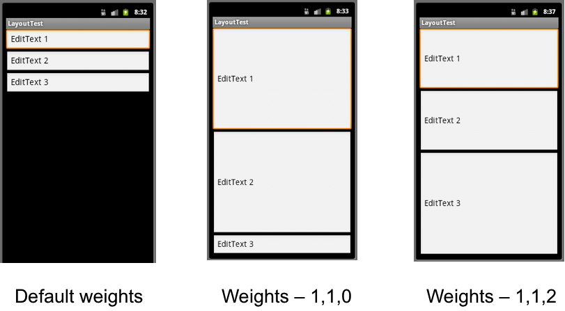
Hint: To have widgets proportionally scale to fit all available space, simply set their width/height to 0dip in the desired dimension and weight them accordingly.
Nesting
LinearLayout groups (actually any layout type) can be nested inside other LinearLayout groups. All widget attributes, e.g. fill sizes, weights, etc., are relative to the enclosing layout. Thus more complicated layouts can be created by appropriate nesting of different layouts. Typically nested LinearLayouts have wrap_content sizing in order to allow room for additional widgets below/beside them.
RelativeLayout
RelativeLayout allows for more flexible placement of widgets relative to each other and their parent window without necessitating a top-down or left-right organization (thus sometimes simplifying a nested LinearLayout view). However care must be taken such that there are no circular dependencies between widgets in the layout. To utilize a RelativeLayout, each widget usually needs to have an id attribute in order to determine which other widgets their positioning is relative to (unless they are strictly positioned relative to the parent window). Clearly in the XML layout file, elements must be specified in the order in which they are referred to, i.e. a widget must exist before another can be positioned relative to it.
All of the alignment options are specified in RelativeLayout.LayoutParams with some common ones being:
- layout_alignParent[Top, Bottom, Left, Right] - positions the widget at one of the edges of the parent window.
- layout_above - positions the widget above another widget (using id)
- layout_below - positions the widget below another widget (using id)
- layout_toLeftOf - positions the widget to the left of another widget (using id)
- layout_toRightOf - positions the widget to the right of another widget (using id)
- layout_align[Top, Bottom, Left, Right] - positions the widget so that the edge is aligned with the corresponding edge of another widget (using id)
- layout_center[Vertical, Horizontal] - positions the widget in the center (vertically or horizontally) in the parent
- layout_centerInParent - centers the widget in the parent window
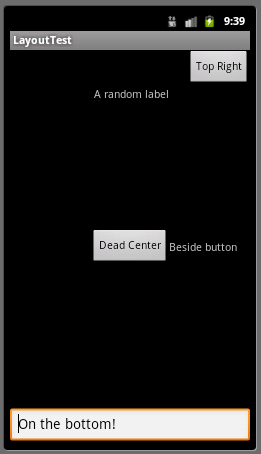
Hence an example of a RelativeLayout might be:
<RelativeLayout xmlns:android="http://schemas.android.com/apk/res/android"
    android:layout_width="fill_parent"
    android:layout_height="fill_parent">
    <Button
        android:id="@+id/middleButton"
        android:layout_width="wrap_content"
        android:layout_height="wrap_content"
        android:layout_centerInParent="true"
        android:text="Dead Center"
    />

    <EditText
        android:id="@+id/atBottomText"
        android:layout_width="fill_parent"
        android:layout_height="wrap_content"
        android:layout_alignParentBottom="true"
        android:text="On the bottom!"
    />

    <TextView
        android:id="@+id/buttonText"
        android:layout_width="wrap_content"
        android:layout_height="wrap_content"
        android:layout_centerVertical="true"
        android:layout_toRightOf="@id/middleButton"
        android:text="Beside button"
    />

    <Button
        android:id="@+id/topRightButton"
        android:layout_width="wrap_content"
        android:layout_height="wrap_content"
        android:layout_alignParentTop="true"
        android:layout_alignParentRight="true"
        android:text="Top Right"
    />

    <TextView
        android:id="@+id/randomLabel"
        android:layout_width="wrap_content"
        android:layout_height="wrap_content"
        android:layout_below="@id/topRightButton"
        android:layout_alignRight="@id/middleButton"
        android:text="A random label"
    />
</RelativeLayout>
Which renders as
TableLayout
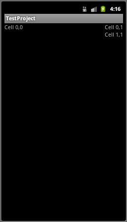
TableLayout is a way to organize widgets into rows/columns (without borders for the cells) similar to HTML tables. All rows will have the same number of columns (determined by the row with the most columns). Cells may be empty but cannot span columns. The table layout is comprised of TableRow child views which behaves similarly to a LinearLayout with horizontal orientation. Nested inside the TableRow structure are the widgets for that row (note the widgets do not specify a layout_width attribute). The width of a column will be set to the width of the widest cell in the column. However, columns can be specified as shrinkable and/or stretchable such that the table can shrink to fit inside the parent or stretched to fill any extra space. Finally the column for a widget can be explicitly specified using the layout_column attribute, but columns must be specified in increasing order in a given row (with gaps interpreted as empty cells).
Hence an example of a TableLayout might be:
<TableLayout
    android:id="@+id/exampleTable"
    android:layout_width="fill_parent"
    android:layout_height="wrap_content"
    android:stretchColumns="0">

    <TableRow>
        <TextView
            android:text="Cell 0,0"
        />
        <TextView
            android:text="Cell 0,1"
        />
    </TableRow>

    <TableRow>
        <TextView
            android:layout_column="1"
            android:text="Cell 1,1"
        />
    </TableRow>
</TableLayout>
which would render as